Fidify
Fidify is an AI-powered KYC and AML compliance platform — built for banks, fintechs, fund administrators and management companies working across complicated jurisdictions. The challenge wasn't the product. The challenge was framing it. How do you make something this technical feel clear to a Chief Risk Officer, without losing the precision that the compliance team needs day-to-day?
- Client
- Fidify Group
- Year
- 2025
- Role
- Web design, content direction, brand voice
- Deliverables
- — Site architecture for the marketing site— Page-by-page narrative & copy direction— Brand voice for a regulated category— Visual system: enterprise-grade, calm, defensible
The context
95 days. That's the industry baseline for a single corporate KYC review.
Behind that number: reviewers chasing low-signal alerts, switching tools per file, rebuilding policy logic every time staff turn over. And the people buying the software — Chief Risk Officers, Heads of Compliance, MLROs — aren't shopping for features. They're shopping for something they can defend.
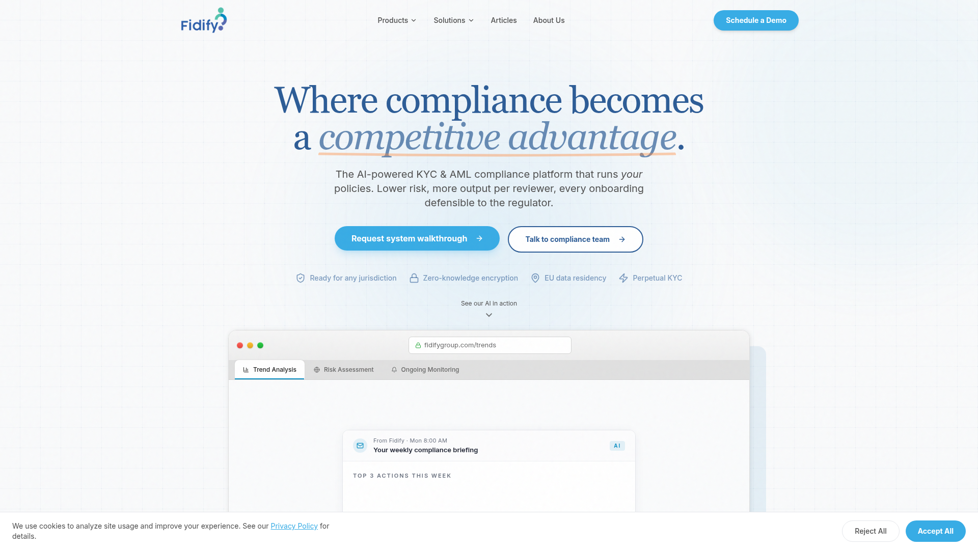
Most compliance sites read like product manuals. Long feature lists. Regulator acronyms. Dashboard screenshots. But decision-makers don't read those pages — they scan them, then forward them to a CFO who needs to grasp the value in under a minute.
So the site had three jobs. Earn credibility before anyone books a demo. Lead with the outcome — 80% faster reviews, perpetual KYC, audit trail by default. And hold up when a regulated buying committee starts pulling it apart.
What I contributed
Web design and brand direction across the Fidify marketing site — the first surface a prospect ever touches. My work sat across information architecture, narrative flow, copy direction and parts of the visual system.
Every page answers one question at a time. What does it do? Why is it defensible? Who already trusts it? What happens next? One proposition per section. Outcomes before features. Proof before pitch.
Narrative approach
The story moves in four steps.
First, the promise — "Where efficiency becomes ROI." Then the cost of doing nothing: 95 days per corporate KYC. Then the spine of the product — policies, thresholds, audit trail — described in the language compliance teams already speak. Finally, one easy next step: bring a sample entity, watch your own policy run on a real file.
And every section was written to be forwarded. Lifted out of the page, dropped into an internal deck, still makes sense. That's how compliance tools actually get bought — by someone inside the institution who has to champion them.
Product story on the site
The site presents Fidify as one system, not a catalogue.
Fidify Enterprise — automated KYC for complex multi-tier corporate clients. Configurable policies, approval chains, risk thresholds. Built for firms that govern, not just process.
Fidify Business — out-of-the-box workflows for smaller firms. Document collection, UBO mapping, screening — all through one portal, no bespoke configuration needed.
Fidify Ecosystem — the glue. Onboarding feeds perpetual monitoring. Monitoring triggers reviews. Reviews generate reports. One audit trail across all of it.
Visual language
The site is dressed more like a law firm than a SaaS startup. Serif type for confidence. A calm blue-and-ivory palette that reads as institutional, not playful. Generous whitespace. Product shots inside browser chrome, so the platform feels real before the demo.
Trust signals are there — "Ready for any jurisdiction", "Zero-knowledge encryption", "EU data residency", "Perpetual KYC" — but quiet. Placed where a risk officer's eye lands, not where a marketer would shout.
Outcome
The enterprise team now has a surface they can sell against. Compliance buyers have pages they can forward to a CFO without having to translate them first. And the digital presence finally matches the seriousness of the category Fidify works in — with a narrative system that can stretch as the product grows.
- Compliance
- Enterprise
- Digital experience